带误差条的线图 / Line plot with error bar in R
线图(Line plots)的生成方法跟点图(Scatter plots)的产生方法大致相同,这两者都符合“plot”这一命令(command)和其他的定义(customizations),比如定义axes, box, labels, text, arrows, gridlines, colors, symbols, and legends等,用法也相同。
线图和点图的差别在于概念上:如果x轴是顺序变量(ordered sequence)或时间变量(time variable),而不是预测变量(predictor variable),就应该把数据点连接成线。其他情况下就不应把点连接成线。
在线图中,可以将y轴的起始点定为0(比如说某个指标的程度随着时间变化),但是这点并不是强制的[1]。


基本线图
如仅仅描述某一变量随着时间(或顺序)的变化,则可以用简单线图。比如这里的示例数据如下,我们想绘出March, April, May三个月份的值在随着年份的变化:
 |
R代码可以如下。从所得结果中可以定义线图的各个特征。
x <- data$YEAR
y3 <- data$T_MAR
y4 <- data$T_APR
y5 <- data$T_MAY
yall <- data.frame(y3, y4, y5)
par(mfrow=c(2,3))
matplot(x, yall, type="b", pch=1, col=1:3, main="Pic. 1")
matplot(x, yall, type="p", pch=1, col=1:3, main="Pic. 2")
matplot(x, yall, type="o", pch=19, col=1:3, main="Pic. 3") # type="o" is overlap,it's usually used when symbol is filled such as pch=19
matplot(x, yall, type="l", pch=1, col=1:3, main="Pic. 4") # types are all line
matplot(x, yall, type="pll", pch=1, col=1:3, main="Pic. 5") # types are respectively point,line,and line
matplot(x, yall, type="l", pch=1, col=1:3, lty=c(1,3,5), main="Pic. 6") # line types are 1, 3, and 5

两个Y轴的线图
有时需要在同一图中放置两个Y轴,以比较两个因变量随着同一自变量变化有什么不同,这时候就要在基本坐标轴的右边放置第二个Y轴,并且定义好两个Y轴的标尺,以及相应两个曲线的标签。
(接以上代码)
par(mar=c(5,4,4,5)+.1) # Make some space for the second Y-axes
matplot(x, y3, type="b", pch=1, col=1:3) # Draw plot of x~y3
par(new=T) # Important command for this
plot(data$BUD ~ data$YEAR, type="o", ann=F, axes=F, pch=19, ylim=c(60,100)) # Add the second curve to plot
axis(4, las=2) # Add the second Y-axes. las=2 is to define the direction of Y label
mtext("BUD Value", side=4, padj=4) # Define the label of the second Y-axes
legend("topright", pch=c(1,19), lty=1, legend=c("y3", "BUD")) # Add the labels of the two Y-axis

带Error Bar的线图(已知标准差或标准误)
如果涉及到平均值和标准差或标准误,则需要在线图的每一数据点的平均值上添加误差条。当数据格式像Example Data 1的时候,也就是说SD或SE已经计算出来,也就是说事前已经使用Excel等将数据表进行过总结,已经列出了每个组的标准差或标准误,并一一对应平均值MEAN的时候,则可以根据以下代码画图:
(接以上代码)
par(mfrow=c(1,2))
matplot(data$YEAR, data$BUD, type="o",pch=15,col=1:3,ylim=c(70,110), main="Up&Down Error Bar")
arrows(data$YEAR, data$BUD, data$YEAR,data$BUD+data$BUD_SE, length=0.1, angle=90) # Draw the up error bar
arrows(data$YEAR, data$BUD, data$YEAR,data$BUD-data$BUD_SE, length=0.1, angle=90) # Draw the down error bar
matplot(data$YEAR, data$BUD, type="o",pch=15,col=1:3,ylim=c(70,110), main="Arrow Error Bar")
arrows(data$YEAR,data$BUD+data$BUD_SE, data$YEAR,data$BUD-data$BUD_SE, length=0.1, angle=30) # Draw the arrows of error bar

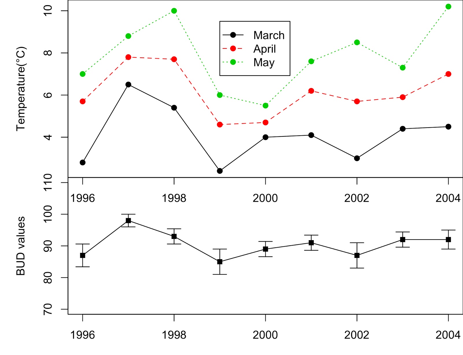
将三个线图放在一个plot图、平均值和误差条放在另一个plot图,再将两个plot合在一起:
par(mfrow=c(2,1))
par(mar=c(0,5,0,0)) # mar is A numerical vector of the form
c(bottom, left, top, right) which gives the number of lines of margin to be specified on the four sides of the plot.
matplot(x, yall, type="o", pch=19, col=1:3, bg=1:3, ylab="Temperature(°C)")
legend(1999, 9.5, lty=c(1,2,3), pch=19, col=1:3, legend=c("March", "April","May"))
par(mar=c(3,5,0,0))
matplot(data$YEAR, data$BUD, type="o",pch=15,col=1:3,ylim=c(70,110), ylab="BUD values")
arrows(data$YEAR, data$BUD, data$YEAR,data$BUD+data$BUD_SE, length=0.1, angle=90)
arrows(data$YEAR, data$BUD, data$YEAR,data$BUD-data$BUD_SE, length=0.1, angle=90)
带Error Bar的线图(标准差或标准误未知)
对于那些未整理汇总的数据(即没有用某种软件计算过各种平均值、标准差或标准误的时候),或者是在R中运算产生的“中间产物/中间数据”,没有明确的标准差或标准误时,则需要先计算该组数据的平均值、标准差、标准误等,然后再绘制带误差条的线图。如示例数据2:
| NO. | len | supp | dose |
| 1 | 4.2 | VC | 0.5 |
| 2 | 11.5 | VC | 0.5 |
| 3 | 7.3 | VC | 0.5 |
| 4 | 5.8 | VC | 0.5 |
| 5 | 6.4 | VC | 0.5 |
| 6 | 10 | VC | 0.5 |
| 7 | 11.2 | VC | 0.5 |
| 8 | 11.2 | VC | 0.5 |
| 9 | 5.2 | VC | 0.5 |
| 10 | 7 | VC | 0.5 |
| 11 | 16.5 | VC | 1 |
| 12 | 16.5 | VC | 1 |
| 13 | 15.2 | VC | 1 |
| 14 | 17.3 | VC | 1 |
| 15 | 22.5 | VC | 1 |
| 16 | 17.3 | VC | 1 |
| 17 | 13.6 | VC | 1 |
| 18 | 14.5 | VC | 1 |
| 19 | 18.8 | VC | 1 |
| 20 | 15.5 | VC | 1 |
| 21 | 23.6 | VC | 2 |
| 22 | 18.5 | VC | 2 |
| 23 | 33.9 | VC | 2 |
| 24 | 25.5 | VC | 2 |
| 25 | 26.4 | VC | 2 |
| 26 | 32.5 | VC | 2 |
| 27 | 26.7 | VC | 2 |
| 28 | 21.5 | VC | 2 |
| 29 | 23.3 | VC | 2 |
| 30 | 29.5 | VC | 2 |
| 31 | 15.2 | OJ | 0.5 |
| 32 | 21.5 | OJ | 0.5 |
| 33 | 17.6 | OJ | 0.5 |
| 34 | 9.7 | OJ | 0.5 |
| 35 | 14.5 | OJ | 0.5 |
| 36 | 10 | OJ | 0.5 |
| 37 | 8.2 | OJ | 0.5 |
| 38 | 9.4 | OJ | 0.5 |
| 39 | 16.5 | OJ | 0.5 |
| 40 | 9.7 | OJ | 0.5 |
| 41 | 19.7 | OJ | 1 |
| 42 | 23.3 | OJ | 1 |
| 43 | 23.6 | OJ | 1 |
| 44 | 26.4 | OJ | 1 |
| 45 | 20 | OJ | 1 |
| 46 | 25.2 | OJ | 1 |
| 47 | 25.8 | OJ | 1 |
| 48 | 21.2 | OJ | 1 |
| 49 | 14.5 | OJ | 1 |
| 50 | 27.3 | OJ | 1 |
| 51 | 25.5 | OJ | 2 |
| 52 | 26.4 | OJ | 2 |
| 53 | 22.4 | OJ | 2 |
| 54 | 24.5 | OJ | 2 |
| 55 | 24.8 | OJ | 2 |
| 56 | 30.9 | OJ | 2 |
| 57 | 26.4 | OJ | 2 |
| 58 | 27.3 | OJ | 2 |
| 59 | 29.4 | OJ | 2 |
| 60 | 23 | OJ | 2 |
计算标准差和标准误
在上一篇博客里介绍了在R中如何分类汇总求平均值,没有介绍求标准差和标准误的方法。这里,就提供计算几组数据的平均值、标准差和标准误的函数:
定义这个计算函数的名称:data_summary
定义函数中的项目(arguements):
data——数据框架
varname——待计算SE/SD的变量的列名称
groupnames——作为分组变量的列的名称
在示例数据2中,len是待计算各值的变量,supp和dose为用于分组的变量。
data_summary <- function(data, varname, groupnames){
require(plyr)
summary_func <- function(x, col){
c(mean = mean(x[[col]], na.rm = TRUE),
sd = sd(x[[col]], se = sd(x[[col]])/sqrt(length(x[[col]]))))
}
data_sum<-ddply(data, groupnames, .fun = summary_func,
varname)
data_sum <- rename(data_sum, c("mean" = varname))
return(data_sum)
}
df <-read.csv("data.csv", sep=";", header=TRUE)
df.sdse <- data_summary(df, varname = "len", groupnames = c("supp", "dose"))
head(df.sdse)
# supp dose len sd se
# 1 OJ 0.5 13.23 4.459709 1.4102837
# 2 OJ 1.0 22.70 3.910953 1.2367520
# 3 OJ 2.0 26.06 2.655058 0.8396031
# 4 VC 0.5 7.98 2.746634 0.8685620
# 5 VC 1.0 16.77 2.515309 0.7954104
# 6 VC 2.0 26.14 4.797731 1.5171757
*** 什么时候使用标准差(standard deviation)?什么时候使用标准误(standard error)?[2]
视自身分析情况而定。如果焦点在数据的分布(spread)和差异性(variability)上,则可以用标准差(sd)来衡量。如果焦点在平均值的准确度(the precision of the means),或者比较、检验平均值之间的差异(the differences between means),则可以用标准误(se)来衡量。
当然,要得到上述平均值或数据置信区间(用标准差),前提是数据必须服从正态分布。当不确定数据是否正态分布时,可以使用自展(bootstrapping)来获得置信区间。
绘制带误差条的线图
这里,我们使用ggplot2程序包中的geom_errorbar()完成[3]:
library(ggplot2)
p <- ggplot(df.sdse, aes(x=dose, y=len, fill=supp))
+ geom_bar(stat="identity", color="black", position=position_dodge())
+ geom_errorbar(aes(ymin=len-sd, ymax=len+sd), width=0.2, position=position_dodge(0.5))
p

使用不同的颜色和背景格式[4],用户可根据自己的喜好选择:
default <- p + labs(title="default", x="Dose (mg)", y = "Length") + scale_fill_manual(values=c('#999999','#E69F00'))
default
gray <- p + labs(title="theme_gray", x="Dose (mg)", y = "Length") +
scale_fill_manual(values=c('#999999','#E69F00')) + theme_gray()
gray
classtic <- p + labs(title="theme_clastic", x="Dose (mg)", y = "Length") +
scale_fill_manual(values=c('#999999','#E69F00')) + theme_classic()
classtic
bw <- p + labs(title="theme_bw", x="Dose (mg)", y = "Length") +
scale_fill_manual(values=c('#999999','#E69F00')) + theme_bw()
bw
linedraw <- p + labs(title="theme_linedraw", x="Dose (mg)", y = "Length") +
scale_fill_manual(values=c('#999999','#E69F00')) + theme_linedraw()
linedraw
light <- p + labs(title="theme_light", x="Dose (mg)", y = "Length") +
scale_fill_manual(values=c('#999999','#E69F00')) + theme_light()
light

如果想像第一个示例数据一样绘制折线图,并带有误差条,则也可使用ggplot2程序包完成[3]:
l <- ggplot(df.sdse, aes(x=dose, y=len, color=supp, group=supp)) +
geom_point(pch=18, cex=4) +
geom_line(lty=1) +
geom_errorbar(aes(ymin=len-sd, ymax=len+sd), width=0.2, position=position_dodge(0.05))
l
## ggplot()中的group必须定义,否则line无法显示 ##

同样,也可使用不同的颜色和背景格式,比较哪一种更美观[4]:
default.l <- l + labs(title="default", x="Dose (mg)", y = "Length") + scale_fill_manual(values=c('#999999','#E69F00'))
default.l
gray.l <- l + labs(title="theme_gray", x="Dose (mg)", y = "Length") +
scale_fill_manual(values=c('#999999','#E69F00')) + theme_gray()
gray.l
classtic.l <- l + labs(title="theme_clastic", x="Dose (mg)", y = "Length") +
scale_fill_manual(values=c('#999999','#E69F00')) + theme_classic()
classtic.l
bw.l <- l + labs(title="theme_bw", x="Dose (mg)", y = "Length") +
scale_fill_manual(values=c('#999999','#E69F00')) + theme_bw()
bw.l
linedraw.l <- l + labs(title="theme_linedraw", x="Dose (mg)", y = "Length") +
scale_fill_manual(values=c('#999999','#E69F00')) + theme_linedraw()
linedraw.l
light.l <- l + labs(title="theme_light", x="Dose (mg)", y = "Length") +
scale_fill_manual(values=c('#999999','#E69F00')) + theme_light()
light.l

参考资料 / References
[1] Line plots with error bars. https://sites.ualberta.ca/~lkgray/uploads/7/3/6/2/7362679/6c_-_line_plots_with_error_bars.pdf
[2] Standard deviation vs Standard error. https://www.r-bloggers.com/standard-deviation-vs-standard-error/
[3] ggplot2 error bars. http://www.sthda.com/english/wiki/ggplot2-error-bars-quick-start-guide-r-software-and-data-visualization
[4] ggplot2 themes and background colors. http://www.sthda.com/english/wiki/ggplot2-themes-and-background-colors-the-3-elements

评论
发表评论